Blog Our Thought.
Mastering Color Theory: How Color Shapes Brand Identity

Color is one of the most powerful tools in a designer’s arsenal. It has the ability to evoke emotions, convey messages, and influence perceptions, all of which are crucial for building a strong brand identity. Understanding and applying color theory effectively can make the difference between a brand that resonates with its audience and one that fades into the background.
In this blog post, we’ll explore the fundamentals of color theory, how it plays a role in shaping brand identity, and the importance of choosing the right colors to reflect a brand’s values and goals.
What is Color Theory?
Color theory refers to the principles that guide the use of color in design. At its core, it’s about understanding how different colors interact with each other, and how they are perceived by the human eye. The primary elements of color theory include the color wheel, color harmonies, and the psychological effects of color.
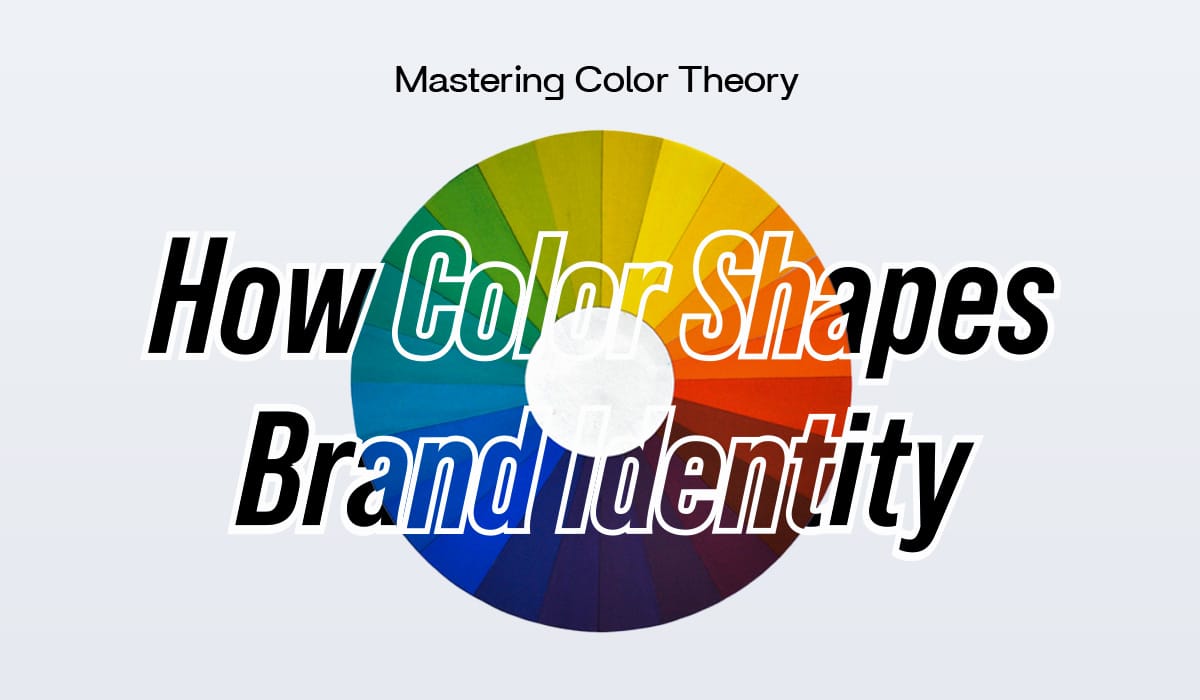
- The Color Wheel: The color wheel is a visual representation of colors arranged in a circle. It includes primary colors (red, blue, yellow), secondary colors (green, orange, purple), and tertiary colors (a mix of primary and secondary colors). Understanding the relationships between these colors is essential in creating visually appealing and harmonious designs.
- Color Harmonies: Color harmonies refer to specific combinations of colors that work well together. These include complementary colors (opposite on the color wheel), analogous colors (next to each other on the color wheel), and triadic colors (three evenly spaced colors on the color wheel). Using these harmonies can create balance and visual interest in your designs.
- Color Psychology: Color psychology explores how colors impact human emotions and behaviors. For example, red is often associated with excitement or urgency, while blue conveys trust and calmness. These associations can be leveraged to influence how people perceive a brand.
Applying Color Theory to Brand Identity
1. Start with Brand Values
The first step in applying color theory to brand identity is understanding the brand’s core values. What does the brand stand for? What emotions does it want to evoke? By answering these questions, brands can begin to align their color choices with their messaging.
For example, a tech startup that wants to be seen as innovative and cutting-edge might opt for bold, futuristic colors like electric blue or neon green. In contrast, a wellness brand focusing on tranquility and relaxation might choose soft, muted colors like pastel blues and greens.
2. Create a Balanced Color Palette
A well-balanced color palette is crucial for maintaining cohesion in branding. A typical brand color palette includes a primary color, secondary colors, and accent colors. The primary color is the one most closely associated with the brand and should be used consistently across all branding materials. Secondary and accent colors add variety and visual interest, but they should complement the primary color and not detract from it.
Using too many colors can make a brand’s identity appear scattered and inconsistent. On the other hand, using a carefully curated palette ensures a cohesive and professional look.
3. Stay Consistent Across All Touchpoints
Consistency is key when it comes to building brand recognition. Brands should use their color palette consistently across all platforms and touchpoints, from websites and social media to product packaging and advertisements. By doing so, they create a unified brand experience that reinforces their identity in the minds of consumers.
Conclusion
Color plays a vital role in shaping brand identity. By understanding color theory and using it strategically, brands can evoke emotions, differentiate themselves from competitors, enhance recognition, and influence consumer behavior. Whether you’re designing a logo, website, or social media campaign, the right color choices can make all the difference in how your brand is perceived and remembered.